
The research named the buyer.

Two worlds, one brand — and neither claimed it.
paskr built construction management software — born on job sites, built by a contractor, sold to general contractors. The founder didn't even like calling it a software company.
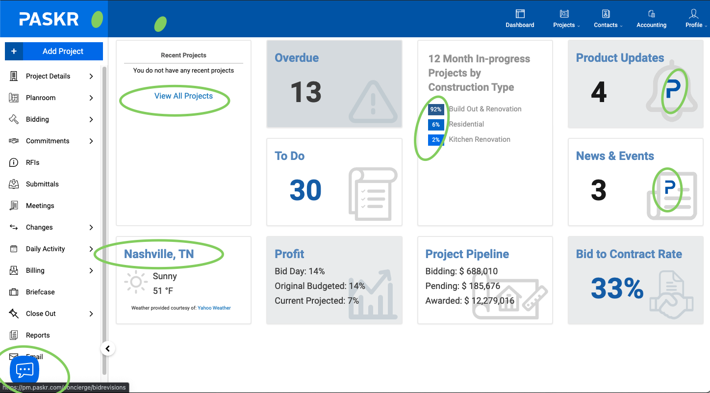
But the brand showed the strain of living in two industries: imagery of empty buildings and tablets, two different logos on the login screen, a retired tagline still in the product, and more shades of blue than anyone could count. It wasn't a bad brand. It was an unclaimed one.
We read both industries before we drew anything.
Six industry reports across two sectors — software publishing on one side, commercial and industrial construction on the other — plus a team-wide brand questionnaire and an audit of every place the brand touched a customer, including inside the product itself.
The software report surfaced something we couldn't unread.
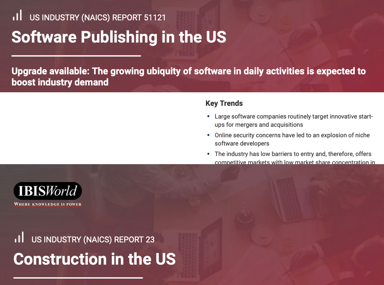
A brand has more than one customer.
Contractors buy the product. Software companies buy companies. We worked with paskr's very talented Marketing Manager, alongside their president and CEO, and showed the brand had to build equity with both — that “we're not a software company” comforted the room but cost the company, and “a construction-first software company” told the truth in a language both industries could read.
Warm the brand for the people on job sites. Keep it credible to the industry watching innovation from above.
Lowercase, warmed up, and chosen by the founder.
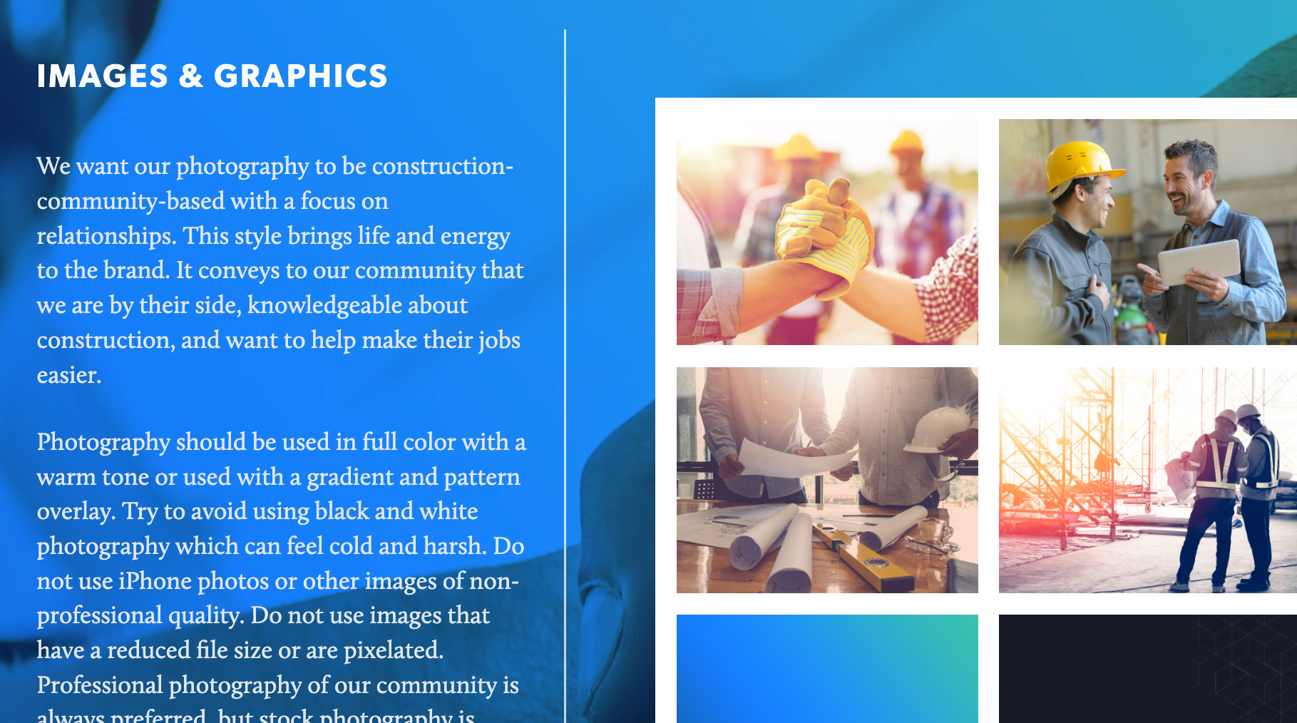
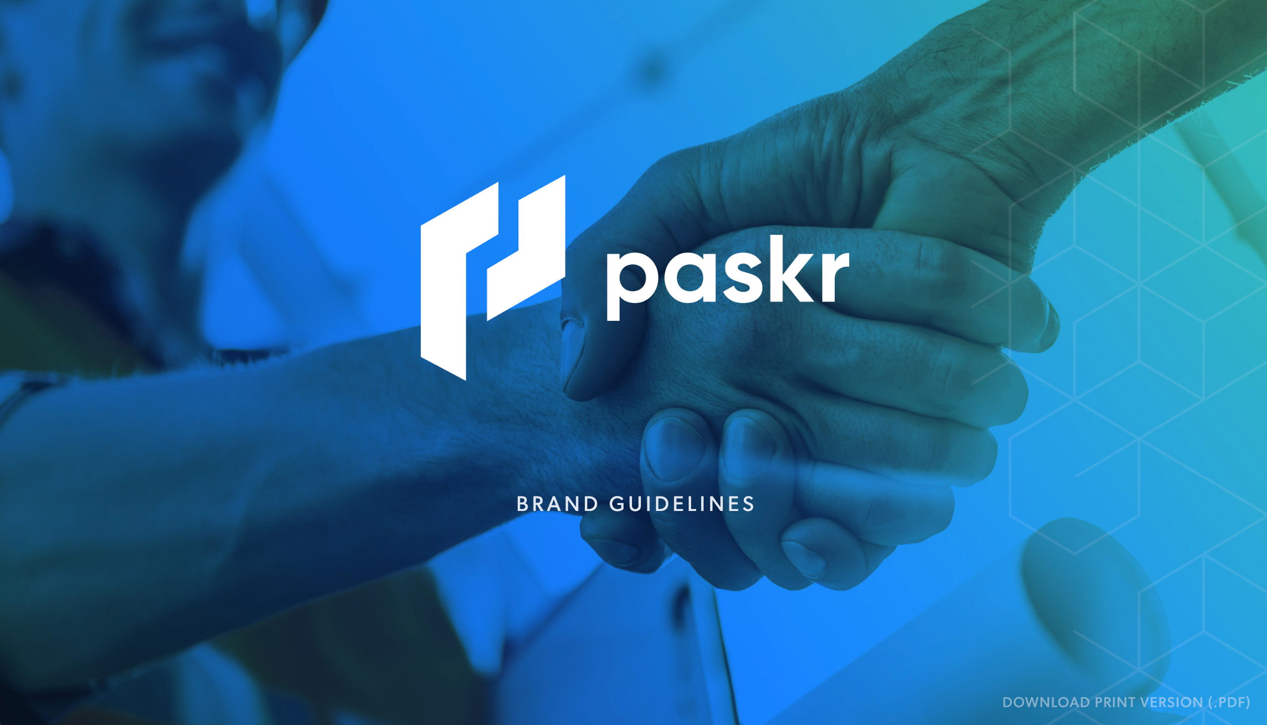
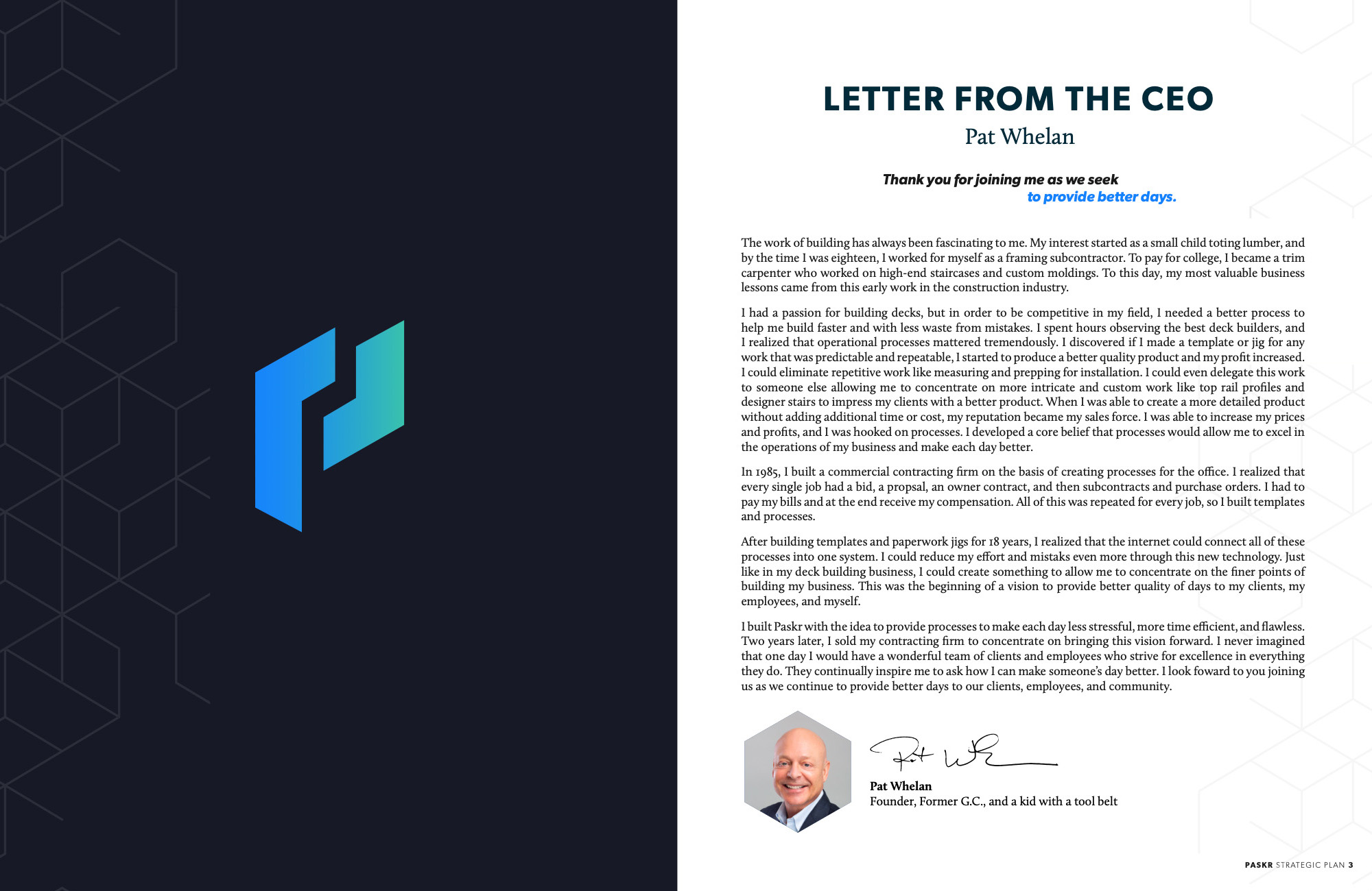
Three concepts went in front of the team. CEO & Founder, Pat — the contractor who built paskr from hard-copy processes — picked the lowercase paskr himself. The identity traded empty buildings and tablets for people and the work in action. The guidelines shipped two ways: a designed PDF and an interactive web version, so consistency had no excuse.
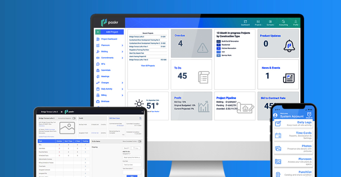
The guidelines didn't stop at just better looking marketing assets. The audit had flagged the login screens, the ghost tagline, the stray hexes — so the standards reached into the software itself — significantly improving the UX.
Through our collective, Nate Farro Design Co. led the design side of this project — and, as Nate always does, nailed the assignment.



The last thing we shipped went in front of the buyers.
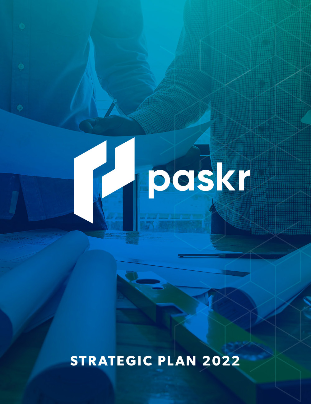
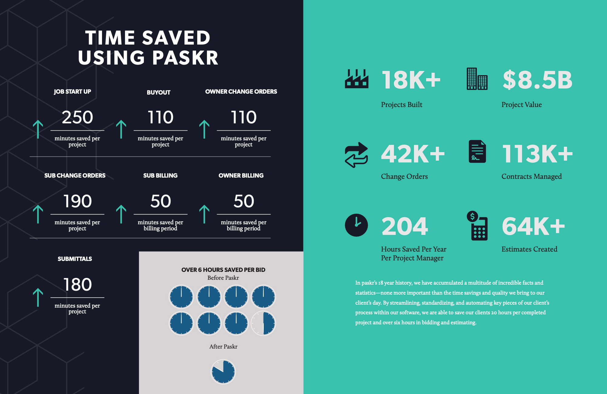
The partnership grew into paskr's printed annual strategic plan — vision, objectives, and financials, designed to the new brand and bound for the board.
The final book was delivered in January. The acquisition announcement came three weeks later.

Both customers showed up.
Within a year of the new brand launching, paskr was acquired by RedTeam — the first name on the competitor whiteboard during brand development. The acquirer's own framing of the deal read like the positioning: contractor-built companies, solving real contractor problems.
The brand didn't sell the company. But it made the company legible to the buyer — and the research had said, in writing, that the buyer was coming.
Research reads like prophecy only in hindsight.
At the time, it just reads like homework. Do the homework anyway.
And remember that every brand has at least two customers: the one who buys what you make, and the one who might buy who you are.