
Rooted and renewed.


The riskiest brand to change is one people love.
Seedbed has been sowing resources and encouragement since 2012 — books, studies, and a daily podcast that gathers tens of thousands every morning. The green sprout was beloved and had served faithfully — but it was straining under everything the ministry had become. What Seedbed communicated visually no longer matched what its community experienced relationally.
Leadership brought us inside to lead marketing, and the brand strategy question came with the seat. The team's caution was real and right: this identity carried twelve years of trust, and trust is the one asset a ministry cannot reprint. Get it wrong, and you don't lose a logo — you make tens of thousands of people feel like strangers in a place they helped build.
Everything the new brand needed already existed in the old one.
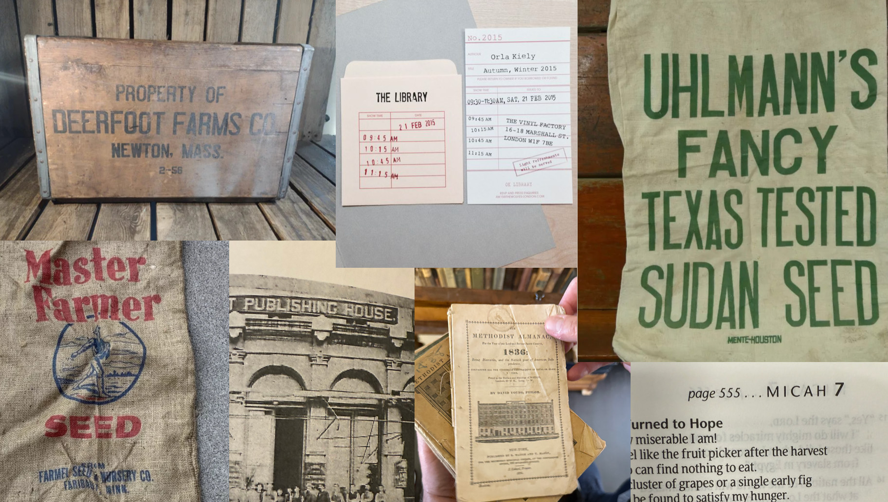
Months of listening before a single concept — the community's own voices in conversations and feedback, the team's words about who Seedbed serves, and heritage research reaching into visual tradition, publishing-house typography, stained glass line work, and the humble seed bag.
The finding underneath it all: the green, the sprout, the name, the mission were not the problem. They were the foundation. Nothing needed replacing. It needed cultivating.


Renewal, not replacement.
The old sprout grew into the new mark — leaves shaped like seeds, the whole cycle in one form: seed to leaf to fruit and back to seed again. The mark stepped out of its old circle, unbound, with stray seeds settling onto the dots of the i's and j's. Every choice was designed to be recognized before it was noticed: the brand people already trusted, brought forward.
Honoring the past isn't a constraint on a rebrand. Done right, it's the engine of one.
The old transformed — made new.
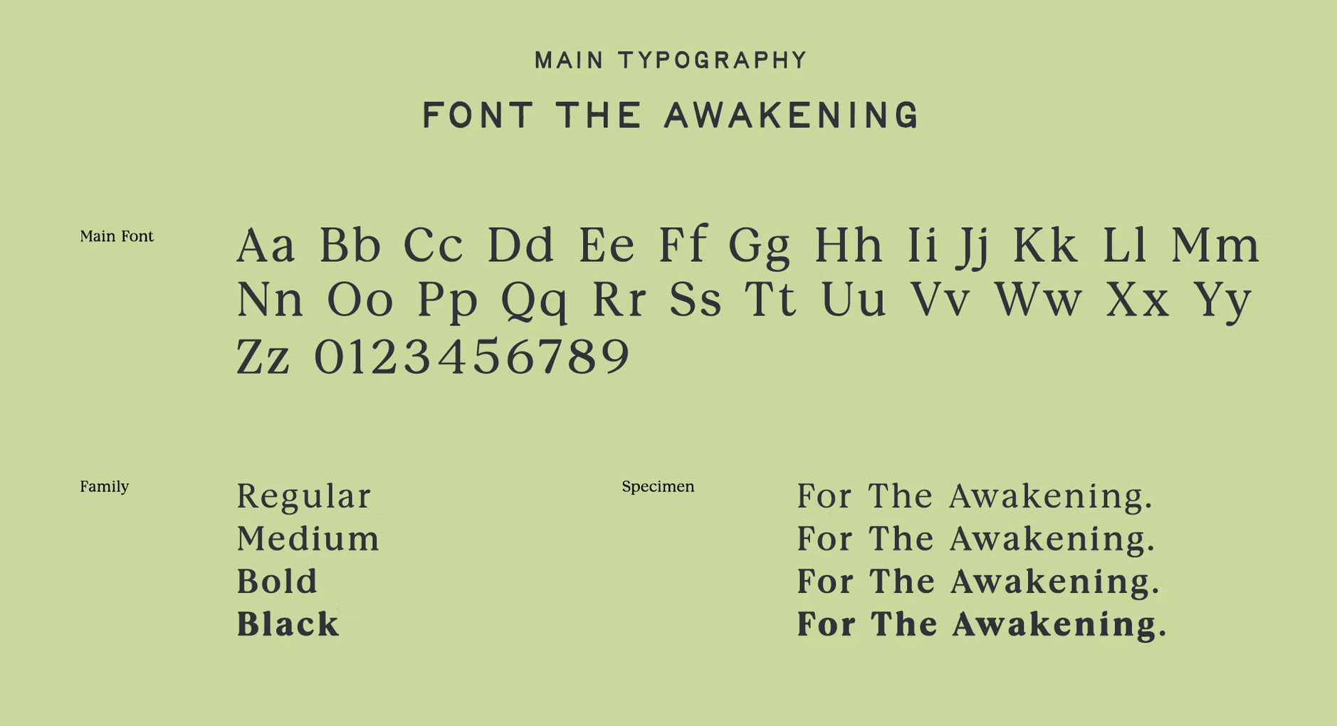
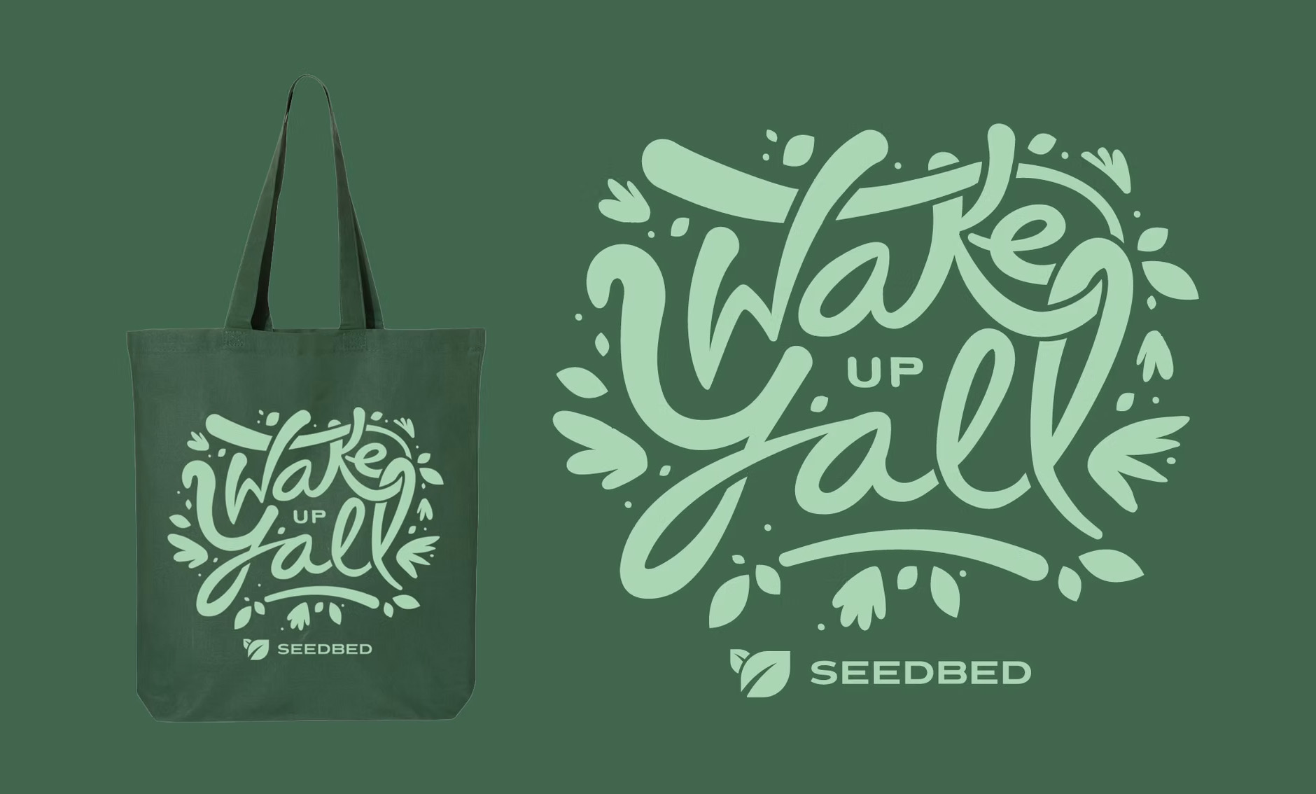
A custom typeface built for them — a nod to the old-book serifs everyone grew up reading, redrawn modern, down to a seed hidden in the letterforms. A display face inspired by a hand-painted sign atop a farmers co-op — serious and playful at once, caught somewhere between selling corn and playing baseball.
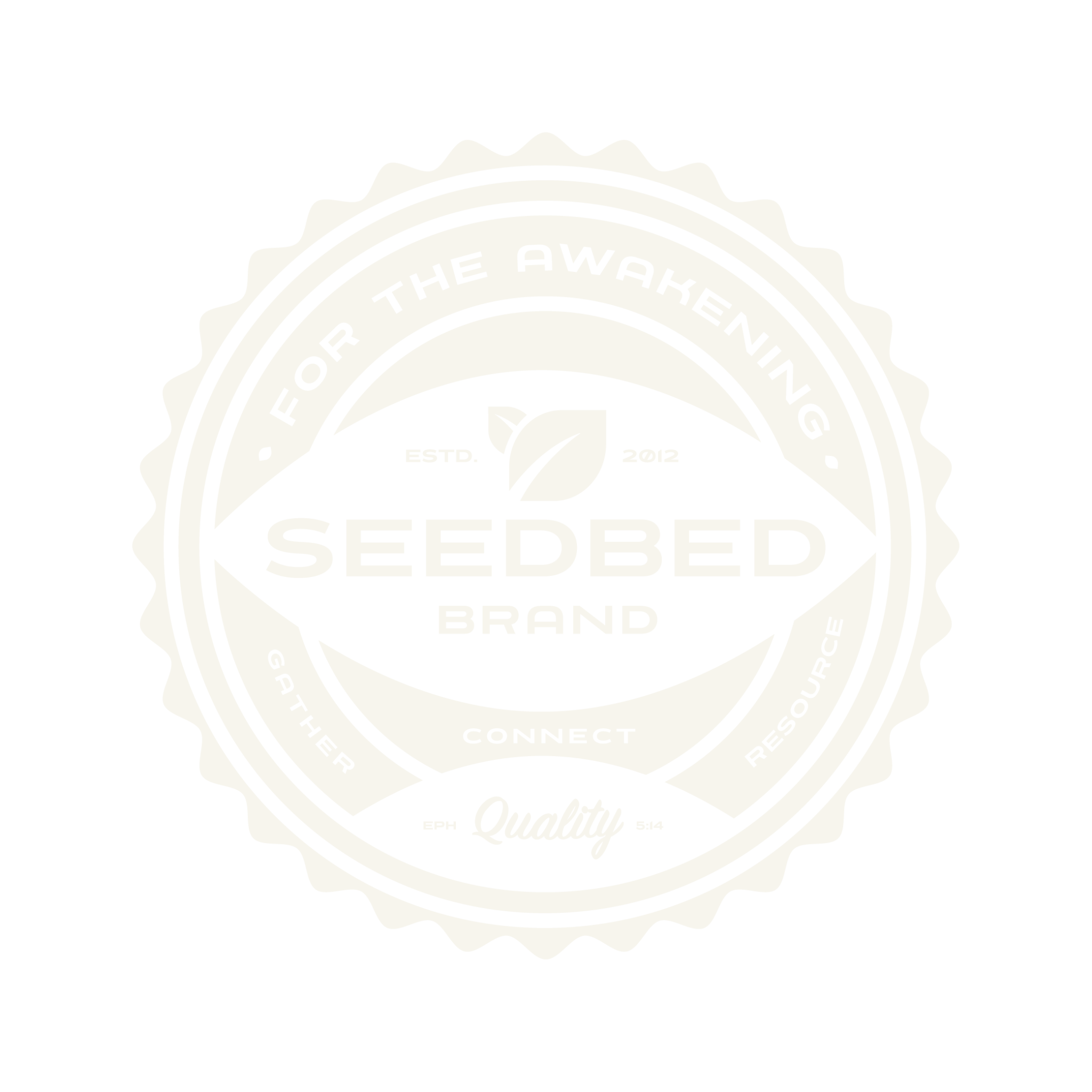
A palette tuned to spring, not fall. And a seal that carries the name, the mission, and Ephesians 5:14 in one mark.
Nate Farro Design Co. led the visual identity for this project. From the mark to the custom typography — painstaking, letter by letter, notches and seeds — Nate's craft is all over it.


Change earns its approval one story at a time.
The renewal was presented the way it was built — patiently. Leadership first: the full story, from research to reasoning, every choice traced back to something the team already valued. Then the whole team — they heard and saw themselves in it. Then the world: the launch announcement, the catalog, the daily email — everything arriving in the new identity together. Questions were welcome, and there were many — every one of them was the team doing its job.
By launch, the people most protective of the old brand were the ones proudest of the new one.
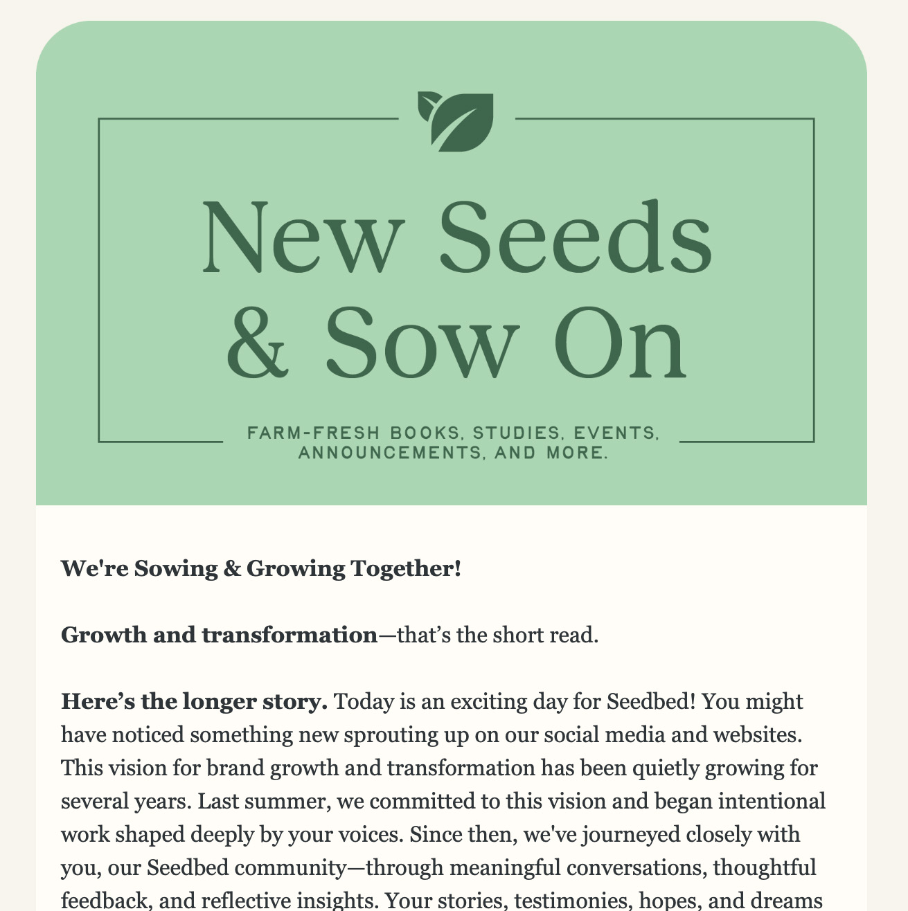
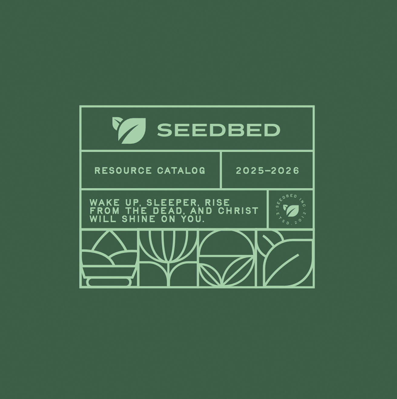


Still the brand on the door.
The best case for change is built from what people already love.
Leading change from inside an organization is different work than advising on it — the trust you spend is your own. Renewal beat replacement here because the research proved the team's instincts right and the brand's roots strong.
We just kept what was alive, and grew it.